Snoik post mortem
Here lie some bits that were cut from the game, and a few words about how it was made.
Mid July, strangest io go “yo, what if videogame”, i go “aye”. Then I enter into a big cartoon tumbledryer and emerge roughed up around mid October. By that point the design and pre production are done and i just do production during reading week in college while getting intoxicated. Then i hand off the files to strio, and they do the rest of the visual magic!👉👉
Initial designering!
There were a bunch of things which were planned but never done! Some ideas that didn't make the initial cut were:
- some kinda trippy arcade where you move in a circle. Then moonpong came out, was really fun, and i decided not to do that
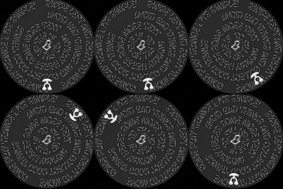
- slalom skating downhill, this idea also repeatedly referred to as "windup triptoy" in my notes
- freeform skating type game where you hang around a lil movement playground and can do funky movement tek
- ynglet or hypnocult type graphics, idk how to describe those exactly
Then i was trying various ideas that were not made, one of which was the video sokpop made on the fake 3d in gamemaker, i thought “oh hey, leaving a trail behind you is easy to do in code and then later interacting with that trail is kinda fun”. So i tried jumping over it for a bit and that didn’t go anywhere, the diagrams got weird. It’s kinda obvious with the answer spelled out right there what would end up being
the game but I had to think about the options that didn’t work out too :(
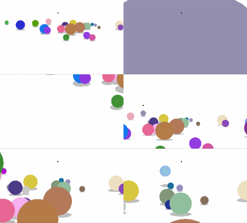

the version where u spit balls and the one where you leave a purple trail behind you
I thought that i could generate some points near your previous body path for you to interact with your past movements but that smelled a bit jank after testing it out on paper. (which hey, when you re making a game that looks like this and plays like that it’s super easy and fun to test on paper actually!)
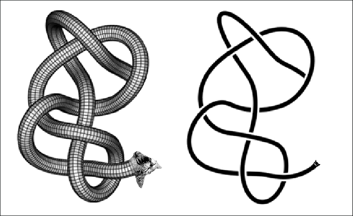
At some point Counterclockwise was brought to my attention https://www.youtube.com/watch?v=Bl-82znkRc0 and by association https://archive.org/details/zx_Knot_in_3D_1983_New_Generation_Software, which i salivated over plagiarizing for a bit before reconsidering.
So anyway, the third dimension was cut due to not adding much to the game but being harder to do. Also most of the interactions would be hard to detect consistently or didn’t have fun discrete results.
I thought about what to do with 3d for a bit, considered doing it swooshy so you weren’t tied to one surface and could choose between 2 but didn’t know how to show clearly where you are or what you'd collide with on playdate type 2 tone graphics.
Intermediate designering!
Thought about design and various ways to spin this specific version of it and had to cut a bunch more stuff
Some rejected futures:
- a cat body and a name referring to that as a pun like knot a cat, other names in dev included: knotasnake, knotaribbon and zavorotkishok(kishka=cat/gut),
- this being about laying down pcb traces (play with discrete dpad mode set to 8, make spaceship sounds with your mouth when you score)
- needing to collect a dot or something somewhere on the map to swap your layer, and needing to collect things in general, took trying things on paper to find an interesting ruleset for whats fun to do & when to swap layer
- the game zooming in very slowly proportional to your points count instead of having a 2x scale portal (harder to optimize but gameplay would also be worse)
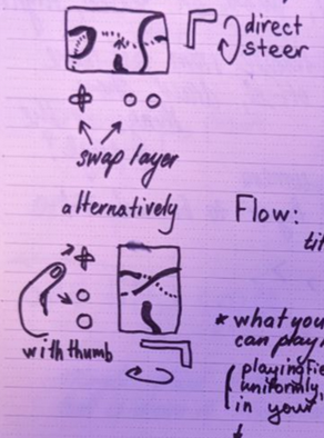
- the game being held sideways like that was an idea for a bit
- pinchazumos was egging me on to make a rollnwrite the entire time i was making this. on some bits you see me trying to like quantify the rules for how to move the line on the paper, but every time i ended up in awkward situations that were impossible to wiggle out of with set in stone rules, n thats the fun part of the game, the non binary failure state, pushing your luck n all that, if you re ever bored i do recommend the freehand pen n paper version of this game
- i thought it'd be fun to add parallax for different layers when you tilted the console but forgot to
- most of the fun XOR and visual flashyness i wanted to do got killed by readability and then also performance considerations :( it coulda looked like this
(given like a day of time i bet i could make this real and it’d run at like 1fps and suck balls for an action game)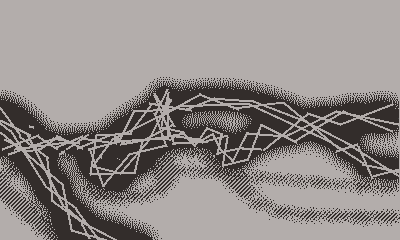
Research? not really
Anyway after messing around with design more i talked to strio again, read the census, did some research on what games were already out there and decided that some optional other things i might wanna do are:
- small play sessions & ability to jump right in
- instructions immediately present but not intrusive
- self directed difficulty (fun design challenge, kid friendly(turns out playdate parents are common) without sacrificing wider gamer appeal)
By that point the design was pretty much nailed down and just needed the edges filed down. Played around with the graphics a lot during development, had to tone them down when i got my hands on a real console cuz it was not up to the task. 2X mode to the rescue! + had to do tons of optimizations.
Cool tech!
The whole game saves your trail to a bitmap and then you collide with the bitmap when you move, but theres 2 of em, 1 per layer (there were 4 of em but then shadows were removed). Actually theres not one but a fuckton of bitmaps, like a whole table of them and every time you move the game only checks your collisions with the nearest ones and only uses them to display the game! Or thats how it would’ve worked in a good world where i actually optimized the game right!The way it works now is still pretty cool tho! I’m pretty sure you can go up to ridiculous map sizes and your movement on them will be linear complexity, but the zooming in itself will get exponentially longer as the game has to rerender the entire past snake in 2x of what it was saved at.
Yea, the game then assembles an image of the tiles you see, draws your last few frames of the trail overtop (so you don't collide with the back of your head), the characters and then sends it all off to be rendered on the big printer in mode7 type distortion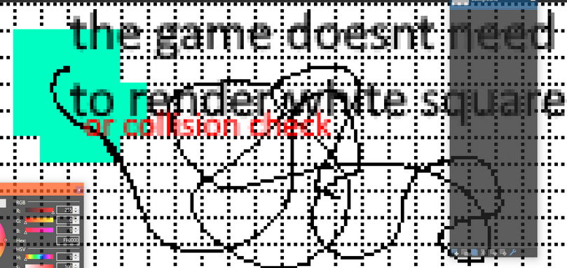
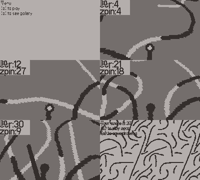
That is all i have fo today. After this my notebook turns into the kind of nerd gibberish that's not even fun to look at. Have some early/mid develpoment gameplay gifs
i don't think this one has collisions or points yet but its kinda fun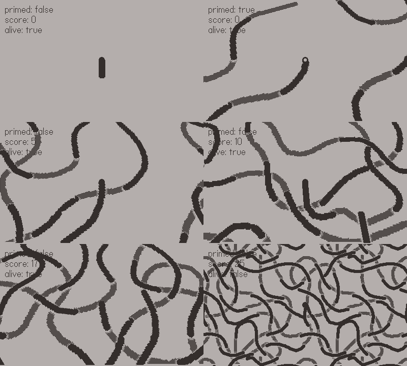
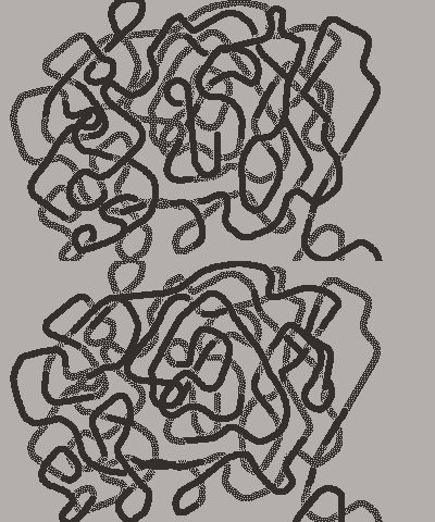
around this point i had to change the way i was doing things significantly so there was some tech funk showing
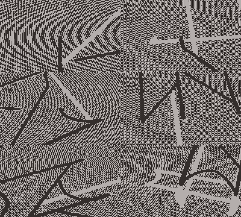
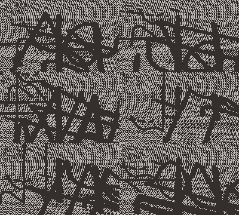
notice the outline in some of them, and the fuzzy edges on the older ones, that's what the "shadow" bitmap was, was also fake parallaxed but was making performance worse and looked ok.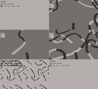

Ash K's weird tutorials
how i make weird things happen and you can too
More posts
- Unpublished visualsJul 13, 2022
- InterpretationsJan 31, 2022
- All of my PostmortemsJan 12, 2022
- Write code, don't dieJan 12, 2022
- Agile tutorialJan 12, 2022
- Sending data from Godot to GoogleSheetsJan 12, 2022
- Orders of noiseJan 12, 2022
Comments
Log in with itch.io to leave a comment.
WOW. Amazing devlog
Also omg that handwriting 😭💖